# Using the Portal Editor

With the Portal feature, you can curate and share specific content with your teams in a simplified user interface. Curated content provides users with the most relevant material, while content filters aid users in finding the correct assets quickly. Vault includes a visual, intuitive Portal Editor to create and manage the Portal Homepage, almost exactly as it appears to Portal users. This makes Portal configuration easier and quicker than managing Portals and content through object records.

The Portal Editor must be <a href="/en/gr/63229/">enabled by an Admin</a>.

## About the Portal Selector Page

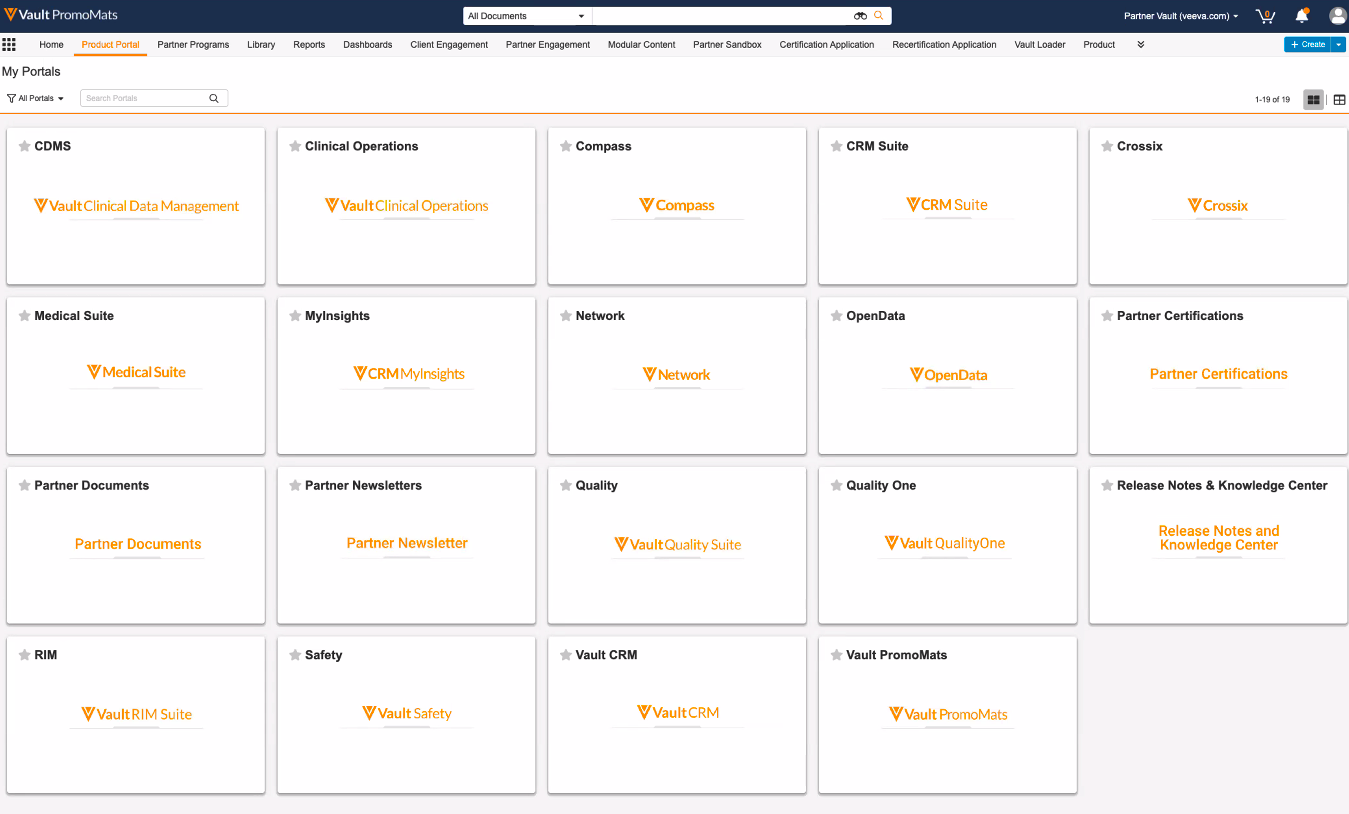
You can see all existing Portals in your Vault, both active and inactive.

From the portal selector page, you can:

  * <a href="/en/gr/555510/#create">Create</a> a new Portal
  * Click the **Launch Portal** icon to view your Portal as it appears to your consumers

<a href="https://platform.veevavault.help/assets/images/Portal_Selector_23r35.png" data-lightbox="Portal_Selector_23r35.png" data-title="" data-alt="Portal Selector page">
  <img class="docimage" src="https://platform.veevavault.help/assets/images/Portal_Selector_23r35.png" alt="Portal Selector page" style="width: 50%;"  />
</a>

## Accessing the Portal Editor

You can  access the Portal Editor by opening a Portal, clicking the [Portal logo][1], and selecting **Edit Portal**.

## Creating a Portal {#create}

To create a new Portal:

  1. Click **Create** on the Portal Selector page. 
  2. Enter a **Portal Name**.
  3. Optional: Enter a **Description**. Click <i class="far fa-external-link-alt"></i> to open the rich text editor.
  4. Optional: Select a **Portal Logo**.
  5. Optional: Enter **About** text. Click <i class="far fa-external-link-alt"></i> to open the rich text editor.
  6. Click **Create** to finish.

Vault creates your _Portal_ record and adds it to the Portal Selector. Creating a Portal requires the _Object: Portal: Create_ permission.

## Configuring a Portal {#edit}

From the Portal Editor, you can edit Portal properties such as the logo, colors, and description, as well as update Portal content. 

### Selecting a Portal Logo {#portal-logo}

The Portal logo displays in the header bar under the _Portal Name_. Click the **Edit** (<i class="far fa-pencil"></i>) icon or anywhere on the logo to select a new logo.

In the **Select new logo** dialog, search or add filters to find a Vault image document to use as the logo. Click the green **plus** (**+**) icon to select a logo. Your logo file should be an image file, such as a PNG or JPEG. If you don't select a logo, Vault displays no logo for the Portal on the Portal Selector page, and displays the standard Vault logo on the Portal Homepage instead.

### Setting a Portal Color

You can set the _Primary_ color for your Portal, which displays in the Portal header bar, navigation arrows, Content Filter icons, and more.

To set a color for your Portal, click into the color blocks. You can use the color slider and your mouse to select a color, or enter a six-digit hex color code. When you finish selecting a color, click **Save**.

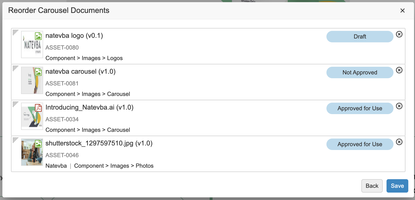
### Adding Content to the Carousel Widget

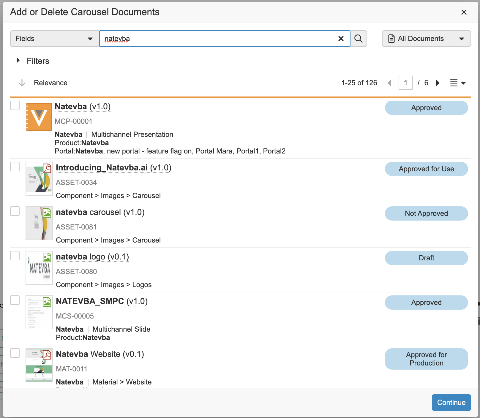
To add content to the Carousel:

  1. Click <i class="far fa-pencil"></i>. 
  2. In the multi-select dialog, select up to eight (8) documents.
  3. Click **Continue**.
  4. Optional: In the _Reorder Carousel Documents_ dialog, drag and drop documents to reorder them.
  5. Click **Save**.
<a href="https://platform.veevavault.help/assets/images/Add_Delete_Carousel_23R13.png" data-lightbox="carousel-portal" data-title="" data-alt="Adding and deleting Carousel content.">
  <img class="docimage" src="https://platform.veevavault.help/assets/images/Add_Delete_Carousel_23R13.png" alt="Adding and deleting Carousel content." style="width: 50%;"  />
</a>

<a href="https://platform.veevavault.help/assets/images/Reordering_Carousel_Content_23R13.png" data-lightbox="carousel-portal" data-title="" data-alt="Reordering Carousel content.">
  <img class="docimage" src="https://platform.veevavault.help/assets/images/Reordering_Carousel_Content_23R13.png" alt="Reordering Carousel content." style="width: 50%;"  />
</a>

### Editing Portal Widget Names

To edit the _Name_ field for your _Portal Widgets_, click the **Edit** icon. When you've finished updating the field, click **Save**.

### Editing the About Section

To edit the _About_ section on your Portal Homepage, click into the text box and enter a description. When you've finished editing, click **Save**.

### Updating the Display Max {#display-max}

The **Display Max** controls the maximum number of items that appear in a given widget in the Portal Homepage. Vault automatically sets the _Display Max_ for each widget, but you can use the **Display Max** control for each Portal to choose to display fewer _Portal Widget Content_ records in that widget. Each _Portal Widget_ object record has a _Display Max_, but you can add more documents to a widget so that users with less access to content still see a full Portal widget.

| Portal Widget | Display Max |
| --- | --- |
| Carousel | 8 |
| Content Filters | 24 |
| Others | 60 |

## Populating Portal Widgets & the Portal Library {#portal-widgets}

When you create your _Portal_, Vault automatically creates the following _Portal Widget_ object records. You can populate some of these with content manually, while Vault automatically populates and updates others.

  * **Carousel**: You can display content as a large click-through banner at the top of the Portal Homepage with the _Carousel_ widget.
  * **Content Filters**: You can create custom views in your Portal Library and then assign them to your Portal. Your Portal users can use these content filters to easily find filtered content. 
  * **Featured Items**: You can display the top content that you want Portal users to see in the _Featured Items_ widget.
  * **Additional Content 1-9**: You can manually select content that you want to appear in these widgets. We recommend renaming the widget to reflect the content.

## Working with Document Widgets

<div class="note-border alert-info">
  <div class="alert alert-info" role="alert">
    <div><i class="far fa-info-circle"></i></div>
    <div class="alert-text">
      <p><strong>Note</strong>: You can activate a maximum of ten (10) document widgets per Portal.</p>
    </div>
  </div>
</div>


### System-Generated Document Widgets

Vault automatically adds the following five (5) widgets to the Portal Homepage. These widgets provide options for teams to build a more specific Portal experience for users, with minimal maintenance. We recommend displaying one of these widgets on your Portal Homepage and setting the rest to _Inactive_.

  * **Coming Soon**: Vault automatically populates the _Coming Soon_ widget with the documents assigned to your Portal that are in the _In Review_ or _Starting_ state. This widget provides user visibility into content that will soon be approved and available.
  * **Recently Added**: Vault automatically populates the _Recently Added_ widget with the steady state documents that were recently added to the Portal.
  * **Most Active**: Vault uses the _Document Usage_ object to automatically populate the _Most Active_ widget with the documents that have the most activity in your Vault. Document activity includes views, copies, downloads, and rendition downloads. Learn more about the <a href="/en/gr/555512/#document-usage">_Document Usage_ object</a>.
  * **Most Viewed**: Vault uses the _Document Usage_ object to automatically populate the _Most Viewed_ widget with the most viewed documents that exist in your Vault. Learn more about the <a href="/en/gr/555512/#document-usage">_Document Usage_ object</a>.
  * **Most Popular**: Vault automatically populates the _Most Popular_ widget with the _Steady_ state documents that users most frequently download in your Portal.

### Custom Document Widgets

Custom document widgets allow you to tailor each Portal to further meet the needs of your teams. The number of Custom Document Widgets available depends on the number of System Generated Widgets that you have active in a Portal. Each Portal can include a maximum of ten (10) Document Widgets. You can name each widget accordingly and re-order content as you'd like it displayed to your end-users.

### Dynamic Widgets

Unlike static widgets, which require users to manually add documents, dynamic widgets update automatically to display documents that match defined filter criteria using <a href="/en/gr/23830/">custom views</a> from the Vault Library or Portal Library. 

#### Dynamic Widget Considerations

  * **Custom views only**: Dynamic widgets only support Vault Library or Portal Library custom views.
  * **Portal homepage search**: Documents displayed in a dynamic widget sourced from a Vault Library custom view do not appear in Portal homepage searches. Create a custom view in the Portal Library to ensure content is searchable in the Portal.
  * **No manual document selection**: Dynamic widgets are driven entirely by the selected custom view. Documents cannot be manually added or removed from the widget.
  * **Live view behavior:** Custom views used in dynamic widgets are live, and any changes saved to the view are immediately reflected in the linked widget.
  * **Empty view behavior**:
      * In _Edit_ mode: If no custom view is selected, Vault displays a _Select a custom view_ message.
      * In _View_ mode: If the selected view returns no documents or is no longer shared, Vault displays a _No content to display_ message.
  * **Permissions requirement**: Portal Admins must ensure that users have _Read_ permission on the _Custom View_ (`custom_view__v`) field on the _Portal Widget_ object to view dynamic widgets. Users must also have the necessary document-level permissions to see the documents returned by the custom view.

#### Creating Dynamic Widgets

To create a dynamic widget:

  1. Click **+ Dynamic Widget**.
  2. Enter a **Name**.
  3. Select a **Custom View** to use as the content source.
  4. Click **Save**.

You can also enable or disable and reorder dynamic widgets in the [_Edit Document Widgets_][2] dialog.

Vault displays the widget as a new tab in your Portal. Documents appear automatically based on the criteria defined in the selected custom view.

<div class="note-border alert-info">
  <div class="alert alert-info" role="alert">
    <div><i class="far fa-info-circle"></i></div>
    <div class="alert-text">
      <p><strong>Note</strong>: You can create a maximum of ten (10) dynamic widgets per Portal.</p>
    </div>
  </div>
</div>


### Adding Content to Portal Widgets

You can click **+ Add Documents** to open a multi-select dialog and populate your Portal widget.

### Removing Content from Portal Widgets

To remove content in your Portal Widgets, click the **X** button for that document. Vault confirms your choice and removes the content from your Portal Widgets. Content removed from Portal Widgets still appears in your Portal Library. See below for details on removing documents from your Portal Library.

### Adding Additional Content to the Portal Library

You can also add content to your Portal Library without adding it to a Portal Widget. This makes the content viewable and searchable while looking in the Portal Library.

  1. Search for and open a document in your Vault Library and click **Edit**.
  2. In the **Portal Details** panel, select the Portals to which you want to add the document.
  3. Complete the **Portal Document** field.
  4. Click **Save**.

You can associate documents with multiple Portals. 

<div class="note-border alert-important">
  <div class="alert alert-important" role="alert">
    <div><i class="far fa-exclamation-circle"></i></div>
    <div class="alert-text">
      <p><strong>Important</strong>: Assigning a <strong>Portal Widget</strong> in the selector does not add the document to that widget. To add a document to a widget, you must navigate to the widget in the Portal Editor and click <strong>+ Add Documents</strong>.</p>
    </div>
  </div>
</div>


### Reordering & Disabling Document Widgets {#reordering}

To reorder and disable document widgets in the Portal Editor:

  1. Click <i class="far fa-pencil"></i> **Edit**.
  2. In the _Edit Document Widgets_ dialog, drag and drop document widgets into the desired order.
  3. Enable or disable widgets using the toggle.
  4. Optional: Click <i class="far fa-pencil"></i> **Edit** to edit the widget.
  5. Click **Save**.

### Disabling Downloads

You may prefer that users make a copy of a Portal rather than download documents from the Portal homepage or <a href="/en/gr/555508/#quick_look_viewer">Quick Look viewer</a>. 

To prevent users from downloading Portal documents while in the Portal Editor: 

  1. Click <i class="far fa-pencil"></i> **Edit**.
  2. In the _Edit Document Widgets_ dialog, clear the **Show Download on Portal Home Page** checkbox.
  3. Click **Save**.

## Ordering Content in Document Widgets

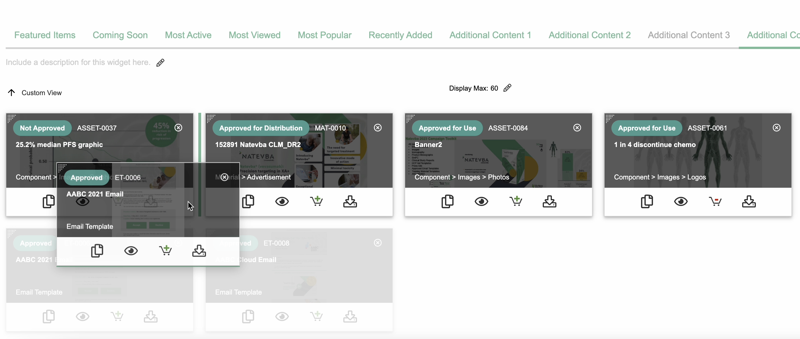
Vault adds documents to Portal widgets according to the order in which you select them from the dialog, and adds new documents after previously added documents to a widget, if present. 

While in the Portal Editor, you can sort documents in widgets by clicking <i class="far fa-arrow-down"></i>, selecting **Custom View**, and dragging and dropping the documents as desired. To drag and drop multiple documents at once, select a document card and press the **Shift** key to select multiple sequential cards, or press the **CTRL** (Windows) or **CMD** (Mac) key to pick documents.

<a href="https://platform.veevavault.help/assets/images/Reordering_Content_New_Portal_23R13.png" data-lightbox="Reordering_Content_New_Portal_23R13.png" data-title="" data-alt="Drag and drop documents to reorder widget content.">
  <img class="docimage" src="https://platform.veevavault.help/assets/images/Reordering_Content_New_Portal_23R13.png" alt="Drag and drop documents to reorder widget content." style="width: 60%;"  />
</a>

## Content Filters

With Content Filters, you can add saved views to your Portal Homepage to display specific content for your users. See <a href="/en/gr/23830/">Using Custom Views</a> for details on creating saved views in your Vault.

Portal users can see Content Filters on the Portal Homepage or in the left-hand panel of the Library. When a user selects a Content Filter, it returns a filtered list of related documents and binders within the Portal or in related Portals.

### Adding a Content Filter {#add-content-filter}

To add a Content Filter to your Portal Homepage using any saved views that you have permission to view:

  1. Open your Portal in edit mode and navigate to the _Content Filter_ widget.
  2. Click <i class="far fa-pencil"></i>.
  3. In the _Edit Content Filters_ dialog, search or add filters to find your custom view.
  4. Select your custom view. Vault automatically adds the view to the _Content Filters_ widget.

By default, your Portal Homepage displays up to 24 Content Filters. You can customize this to any number from 1-24. Open your Portal in edit mode and navigate to the Content Filter widget, then enter a number in the **Display Max** field.

<div class="note-border alert-info">
  <div class="alert alert-info" role="alert">
    <div><i class="far fa-info-circle"></i></div>
    <div class="alert-text">
      <p><strong>Note</strong>: If you are not the original creator of the saved view, you cannot edit the View’s filtering criteria.</p>
    </div>
  </div>
</div>


## About the About Widget

While in the Editor, you can add a Portal description by clicking the <i class="far fa-pencil"></i> icon. The _Description Title_ limit is 125 characters. If you do not enter a title, Vault automatically populates the field as _About_.

You can add rich text formatting and embedded links to the _About_ content. Embedded links open in a new browser tab. 

## About Announcements {#announcements}

You can add content to the Announcements widget to share information with Portal users across a single or multiple Portals. Content in the **Announcements** widget displays in chronological order from newest to oldest.

<div class="note-border alert-info">
  <div class="alert alert-info" role="alert">
    <div><i class="far fa-info-circle"></i></div>
    <div class="alert-text">
      <p><strong>Note</strong>: Vault does not send users notification emails when you add or publish announcements.</p>
    </div>
  </div>
</div>


### Working with Announcements

To add an announcement using the Portal editor:

  1. Click **+ Announcement**.
  2. Enter a **Title**. The limit is 128 characters.
  3. Select a **Publish Date**. Then, click into the field to edit the publish time. You can schedule an announcement to publish in the future by setting this to a future date and time.
  4. Optional: Enter an **Author**. This field manually overrides the name of the user authoring the Announcement. The limit is 100 characters. If left blank, this field displays the name of the object record creator.
  5. Optional: Enter **Body** text for the announcement. The limit is 1,500 characters. We recommend drafting your announcement outside of Vault, and pasting the announcement text into this field when you are ready.
  6. Click **Save**. 

While in the Editor, clicking **View All** opens the Announcements page. From here, you can search or scroll to find existing announcements. Admins can delete announcements via **Business Admin**.

## Adding Related Portals

To add related Portals:

  1. Open a Portal and enter edit mode.
  2. Click the **Action** menu and click **Edit Related Portals**.
  3. Select the Portals to relate.
  4. Click **Continue** to finish.

## Deleting a Portal {#delete}

<div class="note-border alert-info">
  <div class="alert alert-info" role="alert">
    <div><i class="far fa-info-circle"></i></div>
    <div class="alert-text">
      <p><strong>Note</strong>: We recommend inactivating rather than deleting Portals.</p>
    </div>
  </div>
</div>


You can only delete Portals without any content. To delete a Portal, navigate to the portal selector and enter edit mode. Click the **X** in the upper-right corner for that Portal. Vault prompts you to confirm deletion before deleting the Portal. Deleting a Portal cannot be undone.

<div class="note-border alert-info">
  <div class="alert alert-info" role="alert">
    <div><i class="far fa-info-circle"></i></div>
    <div class="alert-text">
      <p><strong>Note</strong>: If you have the <strong>Delete</strong> permission for the <em>Portal</em> object but not for all of its child <em>Portal Widget</em> or <em>Portal Widget Content</em> objects, Vault does not delete the Portal.</p>
    </div>
  </div>
</div>


## About Custom & Panoramic Thumbnails

You can upload specific document renditions for your Portal content to adjust the look of document thumbnails in the Portal Homepage and Portal Library. When available, Vault displays the custom thumbnail in the Portal as opposed to the default thumbnail for the content.

Vault also supports an additional Panoramic Thumbnail rendition type only for the _Carousel_ widget. When creating an image to use as a panoramic thumbnail, we recommend uploading a 1280 x 300 pixel image. If the carousel is larger than the 1280 x 300 pixel space, Vault displays the image with white margins on the left and right sides.

For custom thumbnails, we recommend uploading a 330 x 180 pixel image. While Vault fixes the image thumbnail displayed to 330 x 180 pixels, the card's responsive area depends on a user's screen size.

When uploading a panoramic thumbnail, note that Vault only displays image files and does not display files with viewable renditions.

### Adding a Custom Thumbnail

To add a custom or panoramic thumbnail:

  1. Navigate to your document.
  2. In the Doc Info Renditions panel, click the blue **plus** (**+**) icon.
  3. Select **Custom Thumbnail** or **Panoramic Thumbnail** from the drop-down list.
  4. Choose a file. The file must be an image file or a file with a viewable rendition.
  5. Click **Upload**.

You can set a custom thumbnail for a binder by enabling <a href="/en/gr/4486/#binder_thumbnails">binder thumbnails</a> in your Vault.

## Related Permissions

The following permissions control the ability to create and edit Portals using the Portal editor:

| Type | Permission Label | Controls |
| --- | --- | --- |
| Security Profile | Object: Portal: Read, Create, Edit, Delete | Ability to see, create, edit, and delete _Portal_ object records. |
| Security Profile | Object: Portal Widget: {Portal Widget}: Read, Create, Edit, Delete | Ability to see, create, edit, and delete _Portal Widget_ object records; you need this for each individual _Portal Widget_ object to work with records of the type. |
| Security Profile | Object: Portal Widget Content: {Portal Widget Content}: Read, Create, Edit, Delete | Ability to see, create, edit, and delete _Portal Widget Content_ object records; you need this for each individual _Portal Widget Content_ object to work with records of the type. |
| Security Profile | Views: Share Views | Ability to share custom views with other users. |

### Permissions & the Portal Editor

You must have _Create_, _Edit_, and _Delete_ permissions on the _Portal_ object and all of its _Portal Widget_ and _Portal Widget Content_ child objects to use the Portal Editor fully. Note that if you have one of these permissions on any of the _Portal Widget_ or _Portal Widget Content_ objects, you'll be able to enter edit mode for the Portal. However, you'll only be able to make changes to the widget or content to which you have access.

For example, both Gladys and Phyllis work on the Cholecap brand team. Gladys, who has full permissions to the _Portal_ object and its child objects, can use the Portal Editor in its entirety to manage the Cholecap Portal. Phyllis only has _Edit_ permissions on the _Featured Content_ and _Carousel Portal Widget_ objects. Phyllis can access the Portal Editor for the Cholecap Portal, but is only able to edit existing content in these two widgets.

### Portal Access Control

If you've created multiple Portals, you can use <a href="/en/gr/33946/">Dynamic Access Control</a> or <a href="/en/gr/25494/#custom-sharing-rules">Custom Sharing Rules</a> to grant or deny users access to specific Portals. This is useful if you manage multiple teams and each team needs access only to the Portal for their brand or department.

[1]: #portal-logo
[2]: #reordering